Naviframe
Widget description
Naviframe stands for navigation frame. It’s a views manager for applications.
A naviframe holds views (or pages) as its items. Those items are organized in a stack, so that new items get pushed on top of the old, and only the topmost view is displayed at one time. The transition between views is animated, depending on the theme applied to the widget.
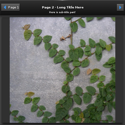
Naviframe views hold spaces to various elements, which are:
- back button, used to navigate to previous views,
- next button, used to navigate to next views in the stack,
- title label,
- sub-title label,
- title icon and
- content area.
Layout content parts
default- The main content of the current pageicon- An icon in the title area of the current pageprev_btn- A button of the current page to go to the previous pagenext_btn- A button of the current page to go to the next page
Layout text parts
default- Title label in the title area of the current pagesubtitle- Sub-title label in the title area of the current page
Most of those content objects can be passed at the time of an item
creation (see push_to()).
Available styles
Naviframe items can have different styles, which affect the transition between views, for example. On the default theme, two of them are supported:
basic- views are switched sliding horizontally, one after the otheroverlap- like the previous one, but the previous view stays at its place and is overlapped by the new
Emitted signals
transition,finished- When the transition is finished in changing the itemtitle,transition,finished- When the title area’s transition is finishedtitle,clicked- User clicked title area
All the parts, for content and text, described here will also be reachable by naviframe items direct calls:
delete()part_text_set()part_text_get()part_content_set()part_content_get()part_content_unset()signal_emit()
What happens is that the topmost item of a naviframe will be the widget’s target layout, when accessed directly. Items lying below the top one can be interacted with this way.
Inheritance diagram
Bases:
efl.elementary.__init__.LayoutClassParameters: - parent (
efl.evas.Object) – The parent object - **kwargs – All the remaining keyword arguments are interpreted as properties of the instance
Get a bottom item on the naviframe stack
Type: NaviframeItem
User clicked title area.
When the title transition is finished.
When the transition is finished in changing the item.
Preserve the content objects when items are popped.
Type: bool
Whether the event when pushing/popping items is enabled
If is True, the contents of the naviframe item will receives events from mouse and keyboard during view changing such as item push/pop.
Warning
Events will be blocked by setting
freeze_eventsinternally. So don’t call the API while pushing/popping items.Type: bool
Pop an item that is on top of the stack
This pops an item that is on the top (visible) of the naviframe, makes it disappear, then deletes the item. The item that was underneath it on the stack will become visible.
See also
Returns: Noneor the content object(ifcontent_preserve_on_popis True).Return type: Object
Simple version of
NaviframeItem.promote().See also
Simple version of
NaviframeItem.push_to().See also
Get a list of all the naviframe items.
Type: tuple of NaviframeItem
Whether prev button(back button) will be created automatically or not.
See also
item_push()
Type: bool
Get a top item on the naviframe stack
Type: NaviframeItem
- parent (
Bases:
efl.elementary.__init__.ObjectItem"default"
Parameters: - title_label (string) – The label in the title area. The name of the title label part is “elm.text.title”
- prev_btn (
Button) – The button to go to the previous item. If it is None, then naviframe will create a back button automatically. The name of the prev_btn part is “elm.swallow.prev_btn” - next_btn (
Button) – The button to go to the next item. Or It could be just an extra function button. The name of the next_btn part is “elm.swallow.next_btn” - content (
Object) – The main content object. The name of content part is “elm.swallow.content” - item_style (string) – The current item style name.
Nonewould be default.
Insert a new item into the naviframe after item after.
The item is inserted into the naviframe straight away without any transition operations. This item will be deleted when it is popped.
See also
Parameters: after ( NaviframeItem) – The naviframe item to insert after.Returns: The created item or Noneupon failure.Return type: NaviframeItem
Insert a new item into the naviframe before item before.
The item is inserted into the naviframe straight away without any transition operations. This item will be deleted when it is popped.
See also
Parameters: before ( NaviframeItem) – The naviframe item to insert before.Returns: The created item or Noneupon failure.Return type: NaviframeItem
Deprecated since version 1.8: Use
pop_to()instead.
Deprecated since version 1.8: Use
promote()instead.
Set a function to be called when the item is going to be popped.
Parameters: func – the callback function. Warning
Don’t set “clicked” callback to the prev button additionally if the function does an exact same logic with this
func. When hardware back key is pressed then both callbacks will be called.New in version 1.14.
Pop the items between the top and the above one on the given item.
Promote an item already in the naviframe stack to the top of the stack
This will take the indicated item and promote it to the top of the stack as if it had been pushed there. The item must already be inside the naviframe stack to work.
Push a new item to the top of the naviframe stack (and show it).
The item pushed becomes one page of the naviframe, this item will be deleted when it is popped.
See also
Returns: The created item or Noneupon failure.Return type: NaviframeItem
The item style.
The following styles are available for this item:
"default"
Type: string
Enable/Disable the title area and the transition effect.
When the title area is disabled, then the controls would be hidden so as to expand the content area to full-size.
Type: getter: bool - setter: (bool, bool) Note
This property is somehow strange, the setter and the getter have different param numbers. The second param in the setter choose if the title transition should be animated or not
See also
New in version 1.9.
Show/Hide the title area
When the title area is invisible, then the controls would be hidden so as to expand the content area to full-size.
Type: bool Deprecated since version 1.9: Use
title_enabledinstead.
Deprecated since version 1.9: Use
title_enabled_get()instead.
Deprecated since version 1.9: Use
title_enabled_set()instead.